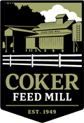
Our 70th anniversary logo has a few images you may or may not have found. It’s no Highlights magazine (anybody else obsessed with this part of your dental visits as a kid?), but take a moment and see if you can find a few things that don’t belong.
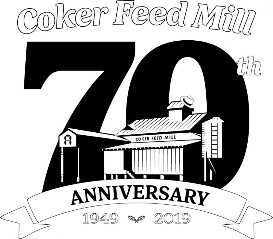
The basis of the logo is our original mill, which opened its doors in December of 1949. Spoiler alert: I’m giving the bonuses first. If you said, “Hey! I was here in ‘49, and I don’t remember a grain bin or a head house,” you got us.
The mill on our logo combines asynchronous pieces of our history. Riley Senior’s first mill didn’t have that little section on the roof we call a head house. It was added later to make room for the grain elevator. (If you don’t know what an elevator is, check out the tallest part of the mill below.)
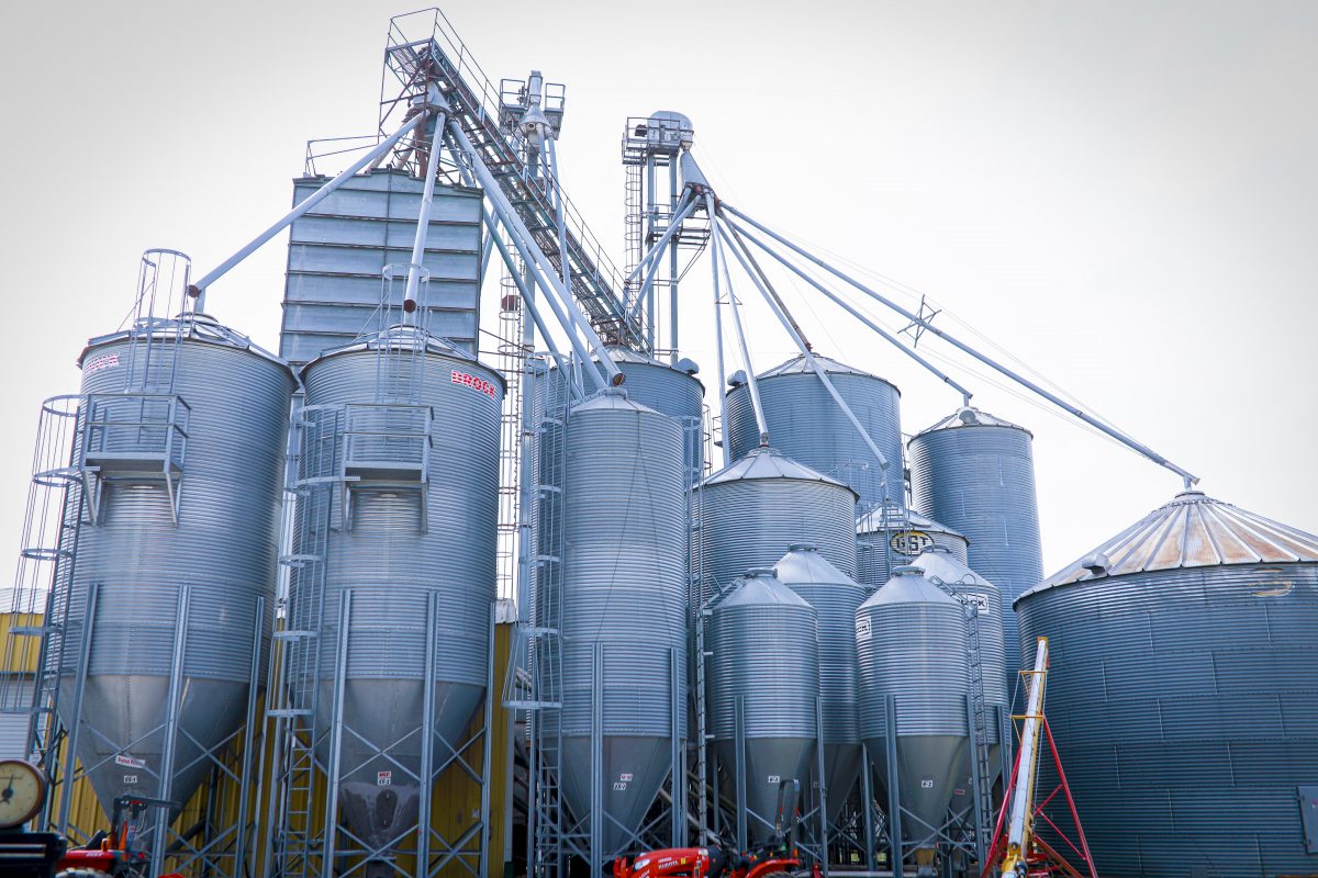
And, you’re right that the grain bin wasn’t there either. Grain bins were added years later on a different part of the property. We added these to our company’s logo as a recognizable symbol of our mill and its growth.
Now for the real hidden symbols added especially for our 70th anniversary:
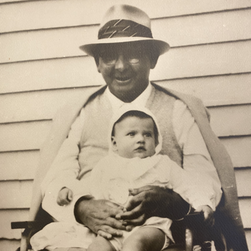
1. A Fedora Hat: Surely you saw the hat resting on the head house. If you knew my granddaddy Riley, the founder of Coker Feed Mill, you’d know it was for him. He was known to sport a fedora (and look pretty sharp in it, I might add.) For this project, we put our hats on to him for his dedication to his faith, his family, and his ethical business practices. Here’s a snapshot of Riley and his son Brantley, the current owner of the mill.
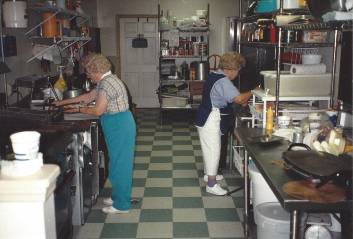
2. A Rolling Pin: One of the columns look a little off to you? Many a little old lady rolled out a pan of biscuits at Coker’s between the late ‘80s and the early 2000s. This particular pin, however, is a tribute to a special lady named Mabel Coker, whose support was a pillar for the company, for her children, and for her community. Here’s to my sweet Grandma. (Extra bonus points if you know which one is Mabel and which is her sister, Ava.)
3. The old Amber Grains logo: Did you know this symbol, the letter A for Amber Grains, has its own hidden symbols? The squiggle in the center is made of two fish and the five ovals represent loaves of bread. It was our little tribute to the abundance of blessings our family has received. While we wanted our new logo to show more clearly that the product line nurtures horses, we have a little hidden loaves and fishes in the grains crossed at the bottom. Check it out.

Did you find them all? Let us know how you did below.

I saw! 🥰 The website looks so amazing.
Love the story. Went back to look . Love old stores like that.need to know your address .
I’m sorry for the late reply, Frances! We’re at 1439 Hood Swamp Road. Our old store and mill was replaced in the 1980s and rennovated last year. It’s not as old and nostalgic, but we’d love to have you out!